The Longest Line Of Sight
09 February 2026The place on Earth from which you can, in theory1, see further than any other is between an unnamed Himalayan ridge near the Indian-Chinese border and Pik Dankova in Kyrgyzstan. It is just over 530km.
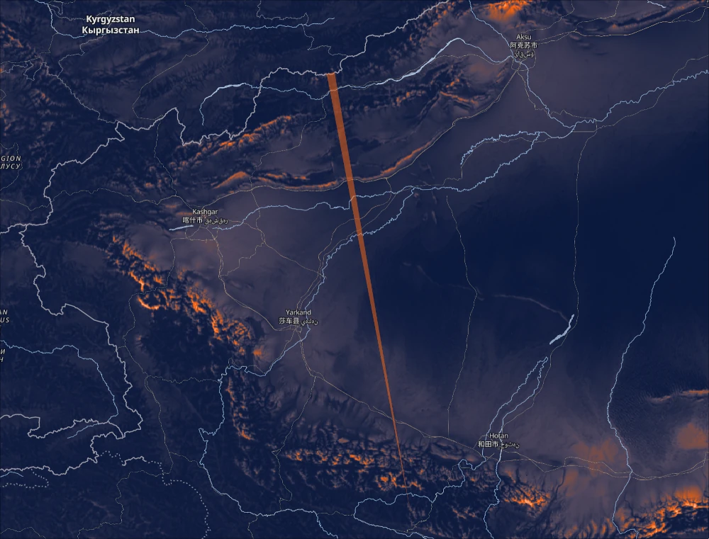
Up until now this view has only been speculated2 to be the longest. But we can now empirically prove it. With the help of my good friend Ryan Berger we have literally calculated every single line of sight on Earth. This involved in the order of 1015, or a million billion, calculations. Which outputs around 200GB of individual longest lines. We present our findings in an interactive map at map.alltheviews.world.
8 Years In The Making
This journey started for me 8 years ago when I was staying on the island of Java in Indonesia:
There are huge volcanoes everywhere there, and I wanted to know where the best place would be to see as many of them as I could. I was working for The Humanitarian OpenStreetMap Team at the time, so had gained some Geographic Information Systems (GIS) knowledge. I started trying to implement an algorithm from a paper entitled Efficient Data Structure and Highly Scalable Algorithm for Total-Viewshed Computation. The basic idea was that you could take advantage of the various repeated calculations when finding all the views, rather than just one view, for a given area. It was the hardest programming I’d ever done. But I managed to implement it from scratch and even made some significant improvements to the algorithm.
With my humble laptop of the time it took a good day of fan-spinning to calculate even just a section of the area I was staying in. And that section wouldn’t even contain the higher peaks of the volcanoes I was interested in. That’s because higher points can usually see further and so require checking more points. I realised that the scale of the problem was such that if I were to implement the code and infrastructure to cover the island of Java, then it would actually only be a matter of twiddling settings to calculate the entire planet.
The only issue was that my estimates for a global run were putting either the compute time at years or the compute costs at hundreds of thousands of dollars. So naturally the project fell to the wayside.
The Flux Capacitor
Thanks to some savings I was lucky enough to be able to spend all of last year working on personal projects. I mostly wanted to deepen my Rust skills. For the first 6 months I developed my terminal eye-candy project Tattoy. Then, more as an afterthought, I just wondered what it would be like to take my Total Viewshed C++ algorithm and Rewrite It In Rust™. I mentioned this on Lobsters’ weekly What Are You Doing This Week thread and my good friend Ryan noticed and started asking me questions. I told him where I’d gotten stuck all those years ago and he confidently assured me that,
“Computers are fast, Tom.”
He has a lot more experience with high performance computing than me, so when he started seriously talking about what it would take to compute the whole world, I believed him.
I had always considered the fundamental problem of the algorithm to be brute CPU cycles. But Ryan naturally intuited that it was more a problem of memory throughput and shape. The algorithm needed to be designed in such a way that the absolute minimum of data was being passed around, and that when it reached the CPU it was aligned so the registers could access it with the least amount of ceremony.
We spent hours on video calls hammering out the details. This diagram became our Flux Capacitor:
![]()
Ryan goes into all the details on his blog, so here I’ll just give a brief overview.
All the coloured foreground squares represent grids of elevation data. Each point in the grid is equally spaced, typically by 100m. The red square is the total extent of the elevation data, but only the green square represents where we can do full line of sight calculations. Consider the upper-left most point in the red square, we can’t calculate what it sees above or to its left simply because the elevation data is not there. Whereas for the upper-left corner of the green square we have all the data needed for looking in all directions.
So staying with the upper-left most point in the green square, to calculate all its lines of sight we must first draw 360 lines eminating from that point. For each of those lines we then find all the other elevation points that the line intersects. With these intersecting points we can then shine a trigonomic “light” and see how far it gets. The light can terminate in 2 ways. Firstly because it hits a mountain or similar, which is either close enough or big enough, that nothing further on the horizon rises above it. Secondly, the light can terminate simply because the Earth is round — at an easily calculated point it will just fly off into space. This whole process is repeated for every point inside the green square.
Here is a simplified diagram of the first 4 points:
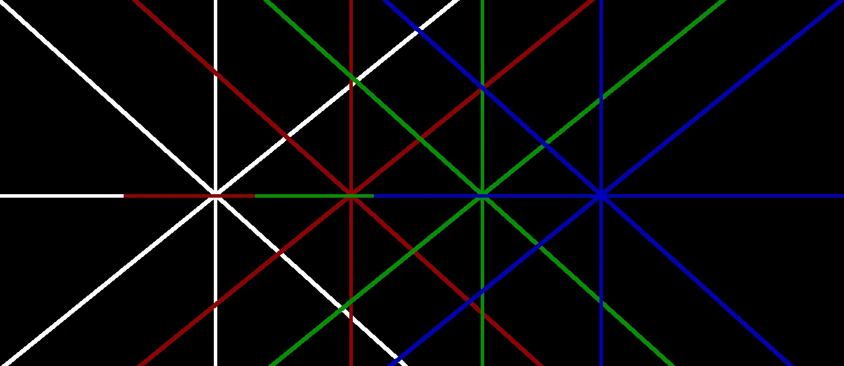
Now, let me show you some of the magic of our approach. What if instead of drawing 360 lines for each point, we instead just rotated the entire grid of data 360 times? To get an intuition for why this is helpful, consider the central horizontal line in the above diagram. Notice that on its left side it perfectly overlaps all the other points’ lines. It turns out that in fact all points can share lines at all angles. And not only does this reduce the amount of trigonometry that needs to be done, but more importantly it dramatically improves memory performance. Even though RAM is Random Access Memory, it is much happier if you read from it sequentially. And rotating the elevation grid ensures that that always happens.
But it gets better! You don’t even have to rotate the entire grid, you only need to rotate the central rectangle of the big white square in the Flux Capacitor diagram above. That’s because the rest of the white square is outside the green square, where, as I mentioned, there isn’t enough data to compute full lines of sight. We came to affectionately call this central rectangle the “Chocolate Bar”.
Eagle-eyed readers may notice that the Chocolate Bar doesn’t actually completely cover the all-important green square. In our video calls we’d rotate the green square with the mouse and it would appear as if the green square’s corners were like dolphins, constantly jumping out of and back into the Chocolate Bar. This led us to realise that the fundamental extent of the grid wasn’t actually a square, but a circle. You can begin to see this in the empty circular space caused by the many orange squares.
There’s even more geeky details, so do checkout Ryan’s post. We’re very proud of it. It’s a contribution to the state of the art and so plan on writing a paper. We’ve made all the code publicly available at: github.com/AllTheLines/CacheTVS
The Pipeline
With the very real possibility that we had a tractable approach to calculating every single view on the planet, I set about designing a processing pipeline to handle the vast amount of data and compute we were going to need.
NASA
The raw data that makes this entire endeavour possible comes from NASA’s Shuttle Radar Topography Mission (SRTM). It is 70GB of raster data. Each point is roughly within the order of 100m apart and represents a single elevation measurement. However, because of the shape of the globe, the Space Shuttle can’t easily take measurements that are precisely the same metric distances from each other. Which is a showstopper for our algorithm, because why waste memory on individual distances if you can know that every point is already guaranteed to be 100m from its neighbour?
But as I would come to discover time and time again, one does not merely reproject distances on a geodesic surface. It is a minefield of nuance and tradeoffs. The gory details could easily go to make up a whole post on their own, but for now it’s enough to know that the approach I ended up with was a locally-anchored tile-specific azimuthal equidistant projection, or AEQD for short. I’ll define a tile after this, but the basic idea is that by giving each one its own custom projection system we reduce to a minimum the accumulation of errors in both distances and relative angular positions.
Tile-Packing The World
One of the first, and hopefully most obvious, optimisations that can be made to the audacious task of computing literally every single combination of mutually visible points on Earth, is just to ignore pairs of points that are say, in the extreme case, on opposite sides of the planet. Of course we can do even better, but how do we safely define a realistic cutoff point?
The theoretical maximum visibility for any given point is actually reliably defined by the height of the point and the radius of the globe. When you’re standing on a beach, your horizon is about 5km away. And indeed, if there were another beach on the other side of the horizon, that just happened to be the same distance from your shared horizon, then it would be possible to glimpse the head of another observer looking back at you. Therefore we can say, without doing any expensive visibility calculations, that the worst case size of data needed for any point at sea level is within a circular region of radius approximately 10km3.
This is the basic definition of a tile.
But we don’t want to make a tile for every single point. We want to aggregate a region of points such that they all fall within the limits of the point with the theoretical longest line of sight. Again, the gory details are enough for another post, which I did in fact already write a few months ago.
To cut a long story short, this is the result:

Atlas: The Automater
With both an algorithm and processed data ready at hand, it’s time to run all the compute. The packer currently creates 2489 tiles of varying sizes that cover all the landmass on Earth. Each tile requires its own beefy machine and can take anything from minutes to hours to complete. We want to be able to process tiles in parallel on multiple machines and for tile failures to not bring down the whole run.
Enter Atlas, a classic worker queue designed specifically for our pipeline. It’s backed by SQLite and uses the excellent Rust Apalis background jobs project.
Visualising The Data
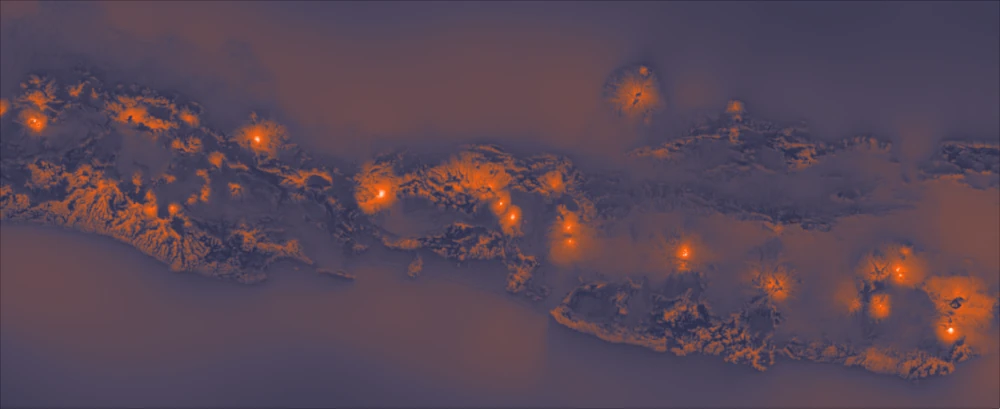
Let’s talk about these pretty heatmaps that I’ve already introduced but not explained yet. Here are some islands from South Korea:
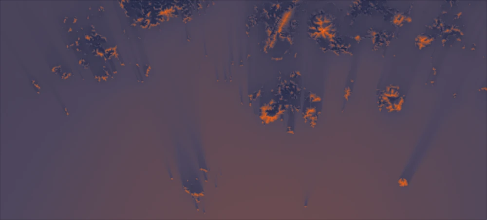
Notice how they seem to be casting shadows? What is the “light” source?
Our algorithm outputs 2 pieces of data:
Firstly it outputs the longest line of sight found for every point. This is just a distance and an angle, which is enough to reconstruct the line on a map. So at the very least our app let’s you click anywhere on the planet and you’ll automatically be shown the longest line of sight at that point. But what if you want to get an overview of all the views in a particular region? You don’t want to be endlessly clicking on every point. Nor could we render all the lines at once, it would just be a noisy riot of slim triangles. This brings us to the other data our algorithm outputs.
Secondly, we calculate the total surface area visible from a given point. This is related to, but subtly different from, longest lines. It’s related in the sense that the further you can see then the wider your horizon. Think of how the small projectors at the back of the cinema can cast big scenes at the front of the cinema. But what if your vantage point was blocked on one side by a high ridge? And that your longest line of sight only appears through a gap in that ridge? That through-line could well be a record breaker, but it wouldn’t necessarily contribute to a record breaking total visible surface area if most of what you can see is merely close by.
In essence, visible surface area is an easily calculable metric that reflects how “good” the views are as a whole. Let’s look again at those apparent shadows in the image above. Just out of frame at the bottom is a large mountainous island. Now imagine you were behind one of those small islands in-frame such that it was blocking the view of the large island. At that point your view would be “worse”, or at least you’d be seeing less of the planet’s surface. And so we render that point with a darker colour. In this sense, the “light source” is land itself!
A Custom Web Renderer
These days rendering global scale GIS data is well supported by a multitude of fantastic open source tooling. Special shout outs to; gdal, rio-tiler, PMTiles and MapLibre GL. But we needed to go slightly off piste. Map rendering typically expects either vector data (think roads, bus stops, place names etc) and imagery (think satellite photos, cloud coverage, etc). But what we render is raw floating point surface area data. Though note that it would be possible to pre-render the heatmaps into conventional, say JPEGs, but that would have one significant downside: it’d be almost impossible to dynamically rescale the heatmap spectrum for different viewports and zoom levels. For example we want you to see both that the Himalayas as a whole have some of the best views on the planet, and that zoomed into the Himalayas themselves there’s a vast diversity of subtle variances amongst the peaks and valleys.
MapLibre has a feature called Custom Layers where you can precisely control every aspect of the rendering, including the vertex and fragment shaders of the GL output. But with great power comes great responsibility. For example, you have to look after your own garbage collection, caching, zoom-level reuse (to prevent flashes of unloaded data), world-wrapping (so that you can infinitely scroll horizontally), and hardest of all, GL texture loading.
GL textures are the memory buffers that hold the raw data for rendering on a GPU. Typically they contain traditional RGBA image data. But as we’re not taking the aforementioned pre-rendered JPEG route, I had to bit-pack our raw f32s into the 4x8bit RGBA texture channels. Bit-packing just means taking the raw 0s and 1s, cutting them up, and moving them around. It’s something we would expect in the Total Viewshed algorithm, but I was surprised that I had to drop down to this level in the renderer. I should say that modern browsers do actually support special R32F buffers, so you can just load the raw float data as is. But unfortunately the support isn’t widespread yet, especially on mobile. And of course debugging this on mobile was way harder than implementing the fix.
Coda
And there you have it, all that effort just to find a single line.
But of course it’s not about the destination, it’s about the journey. I’ve both learnt a huge amount of new technical skills and thoroughly enjoyed myself. It’s such an incredible privilege to have the time and energy to follow your passions and curiosities without the typical pressures of deadlines and profit.
Also it’s great to work with someone so closely at a technical level on a personal project. I don’t think I’ve ever done that. I’ve certainly been paid to work alongside technical colleagues, but now I realise that’s a different thing. You’re always thinking, “is this in the company’s best interests?”. Whereas here I was always thinking, “are we enjoying ourselves?”.
This certainly isn’t the end. We have loads more plans for the project. The main one is providing multiple world runs with varying settings. For example a run with a shorter observer and unfavourable atmospheric refraction, and another run with a taller observer and favourable atmospheric conditions. With that data we could in fact render paired lines of sight that suggest the extremes of visibility from a given point. There’s also NASA’s 30m resolution survey, which contains around 10 times as much data. It would require a lot more compute, but it’s the natural progression for higher resolution renders and more accurate lines.
There’s also the temptation of visiting some of these longest lines of sight. I think a lot of them might require some experienced mountaineering skills. But even it’s just a visit to the longest line of sight in the famously flat country of The Netherlands, it’s a great excuse to get out the house and explore new places on this beautiful and abundantly visible planet of ours.
Footnotes
- This view has not been photographed yet. Not only would it involve serious mountaineering, but also optimal atmospheric conditions: good weather, low pollution and favourable temperature gradients that produce assistive refraction.
- The main source of this speculation comes from a post on the Summit Post forum from 2012. Forum member jbramel speculates that the view from Pik Dankova to China’s Kunlun range may be the longest in the world.
- Astute readers will notice that this also assumes no other higher elevations exist within the region. And you would be right. There are a number of details I’m glossing over in this short overview. Check out the blog post for more details tombh.co.uk/packing-world-lines-of-sight